How Psychology of Color Shapes Architectural Design

Color isn’t just a visual element; it’s a powerful tool that architects wield to shape the emotional landscapes of the spaces they create. Let’s talk about the psychology of color in architectural design. We’ll look into how colors influence our moods, perceptions, and interactions within architectural spaces, offering insights and practical tips for harnessing the emotive potential of color in your designs.
What is the Psychology of Color in Architectural Design?
In interior design, color psychology reigns supreme. It’s the art of selecting hues not just for their aesthetic appeal but also for their ability to evoke specific emotional responses and set distinct moods. Think of it as a painting with emotions, where each color on the palette carries its own psychological weight.
Color psychology in architectural design extends far beyond mere decoration; it’s about creating atmospheres that resonate with occupants on a deeper level. Whether it’s a bustling office space, a serene meditation room, or a cozy living area, the colors we choose can profoundly influence how people feel and behave within these environments.

Why is Color Important in Architectural Design?
Colors aren’t just pretty accents; they serve a multitude of purposes in architectural design. Beyond aesthetics, colors can be used strategically to guide traffic flow, highlight architectural features, and even convey brand identity. For instance, a bold splash of color on an entrance door can draw attention and signal the transition from the exterior to the interior space.
Moreover, colors have practical implications. Warm hues like reds and oranges can visually raise temperatures, while cool tones like blues and greens can create a sense of spaciousness and calm. By understanding the physiological and psychological effects of different colors, architects can optimize both comfort and functionality in their designs.
The Role of Color Meanings
Every color carries its own set of associations and meanings. Warm tones like reds, yellows, and oranges often evoke feelings of energy, passion, and warmth, making them ideal for spaces intended for activity and socialization. On the other hand, cool hues such as blues and greens evoke calmness, tranquility, and a sense of serenity, making them well-suited for spaces designed for relaxation and contemplation.
As architects, it’s crucial to leverage these color meanings to create harmonious and emotionally resonant environments. Whether you’re designing a corporate office, a healthcare facility, or a residential home, the colors you choose can profoundly impact the experiences of the people who inhabit these spaces.
Color Psychology Practical Applications in Architectural Design
Now that we’ve laid the groundwork for understanding the psychology of color in architectural design, let’s look into its practical applications. From selecting the right color palettes to implementing them effectively, architects have a wealth of tools to create emotionally compelling spaces.
The Art of Color Selection
Choosing the perfect color palette is both an art and a science. It requires a keen understanding of color theory and an appreciation for the nuances of human perception and emotion. When selecting colors for a project, architects must consider factors such as cultural associations, personal preferences, and the intended use of the space.
One approach is to start with a mood board, gathering inspiration from diverse sources such as nature, art, and fashion. Experiment with different color combinations to evoke the desired atmosphere – whether it’s a sense of warmth and intimacy or a feeling of openness and clarity.
Creating Visual Hierarchy
Colors can be used strategically to create visual hierarchy within architectural spaces. By varying the intensity, saturation, and placement of colors, architects can draw attention to focal points, define spatial boundaries, and guide occupants through the environment.
For example, a pop of vibrant color on a feature wall can serve as a focal point, drawing the eye and anchoring the space. Conversely, a subtle gradient of shades can create a sense of depth and dimensionality, leading occupants on a visual journey through the space.
Balancing Aesthetics with Functionality
While aesthetics are undoubtedly important, architects must also consider the functional implications of color selection. For instance, in healthcare environments, soothing colors like blues and greens can promote healing and relaxation, helping reduce stress and anxiety among patients and staff.
Similarly, in educational settings, colors can be used to stimulate creativity and enhance concentration. Warm, energizing hues like oranges and yellows can foster a sense of enthusiasm and engagement, while cooler tones like blues and greens can promote calmness and focus.
Integrating Technology and Innovation
In today’s digital age, architects have access to an array of innovative tools and technologies for exploring color concepts and visualizing design ideas. From virtual reality simulations to color-matching software, these tools can streamline the design process and empower architects to bring their vision to life with precision and clarity.
By harnessing the power of technology, architects can experiment with different color schemes, test lighting scenarios, and collaborate with clients and stakeholders in real-time. This iterative approach allows for greater flexibility and creativity, ultimately leading to more dynamic and impactful architectural solutions.
Implementation Strategies for Color in Architectural Design
As we continue talking about the psychology of color in architectural design, it’s essential to look at the practical aspects of implementing color concepts in real-world projects. From understanding material properties to managing client expectations, architects must navigate a range of considerations to ensure successful execution.
Material Selection and Color Rendering
The choice of materials can significantly influence how colors are perceived within architectural spaces. Different materials have unique reflective properties, texture, and sheen, which can alter the appearance of colors under various lighting conditions.
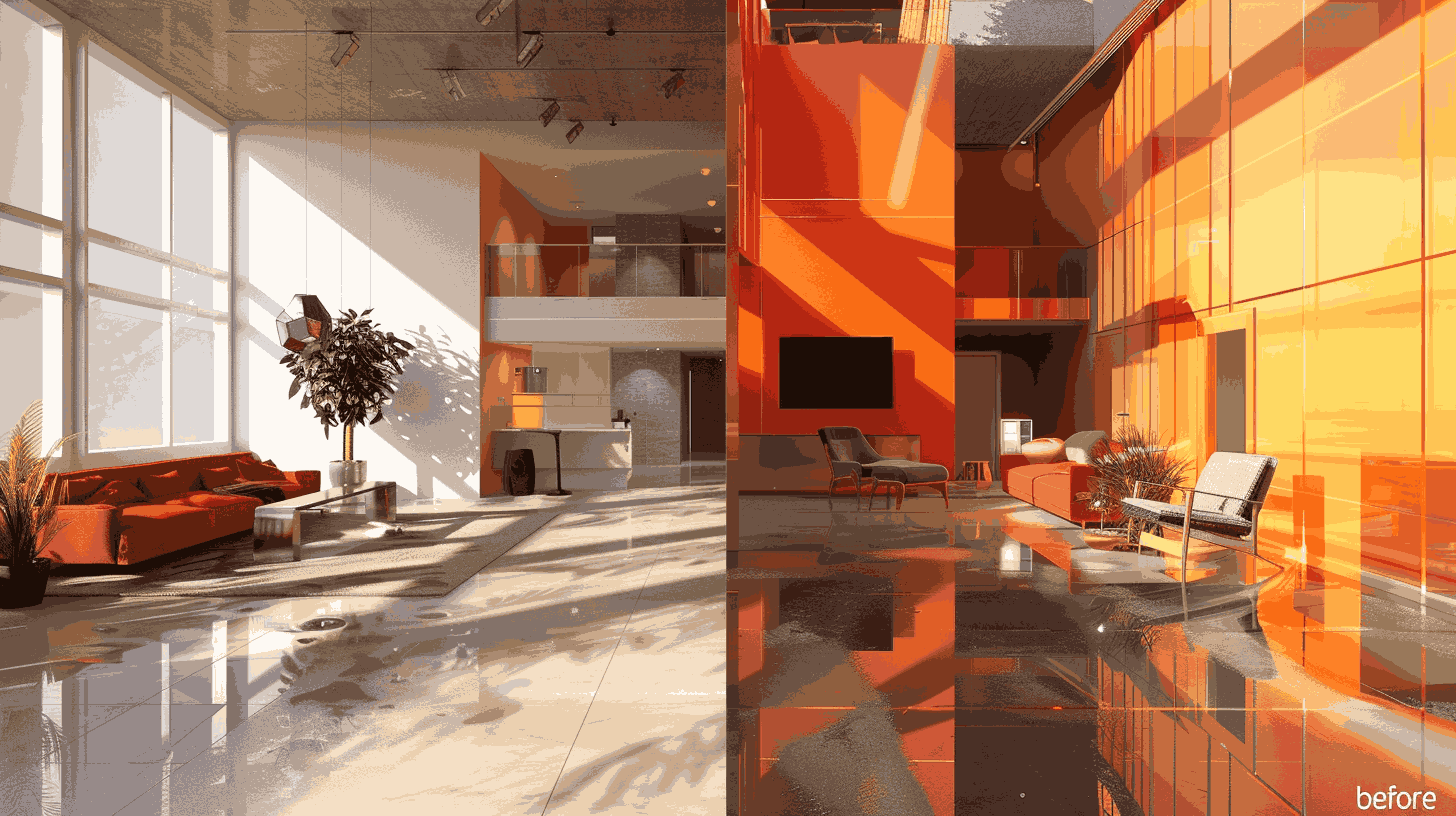
For example, matte finishes tend to absorb more light, resulting in deeper, richer colors, while glossy finishes reflect more light, producing brighter, more vibrant hues. Additionally, natural materials like wood and stone may have inherent color variations and textures that add depth and character to a space.
When selecting materials, architects must consider how they will interact with the chosen color palette and lighting scheme to achieve the desired aesthetic and functional objectives.
Managing Color Consistency
Maintaining color consistency across different materials, finishes, and lighting conditions is critical to ensuring a cohesive and harmonious design. In large-scale projects or multi-use spaces, this can pose a significant challenge, as variations in manufacturing processes, environmental factors, and aging can all impact color perception.
To address this challenge, architects can develop comprehensive color standards and specifications that outline precise color values, finish requirements, and quality control measures. By working closely with manufacturers, suppliers, and contractors, architects can minimize color discrepancies and ensure a consistent visual experience for occupants.
Adapting to Environmental Factors
Architectural spaces are dynamic environments subject to changing lighting conditions throughout the day and across seasons. Natural light, artificial lighting, and the surrounding landscape all influence how colors are perceived, creating opportunities and challenges for architectural designers.
For instance, northern-facing rooms may receive cooler, indirect light, which can enhance the appearance of cool-toned colors like blues and greens. In contrast, southern-facing rooms may receive warmer, direct light, which can intensify warm hues like reds and oranges.
By carefully analyzing the environmental context and integrating lighting design principles, architects can optimize color performance and create visually stunning spaces that adapt to the changing conditions of their surroundings.
Client Collaboration and Communication
Ultimately, the success of any architectural project depends on effective collaboration and communication between the design team and the client. When it comes to color selection and implementation, architects must take the time to understand the client’s vision, preferences, and functional requirements.
Final Word
By involving clients in the decision-making process and providing clear explanations of the rationale behind color choices, architects can build trust and ensure alignment throughout the project. Whether through mood boards, material samples, or virtual renderings, effective communication tools can help clients visualize the intended color scheme and feel confident in the design direction.
Contact Designs Boss today to schedule a consultation and see how we can bring your vision to life with passion, expertise, and a splash of color.
Latest

What Makes a Good Architectural University

What Are The Most Beautiful Bridges Ever Designed

